|
The Prophetic Art Studio Facebook group featured my art titled Get Ready for the month of October 2020. I was surprised to see my art featured in this group, as I had not "entered" or suggested it in the group. It was an honor however, and I was happy to bless others with it. The original painting was a commissioned piece by a sweet lady from my church. She like my painting Regeneration but wanted one that fit her gold frame over her fireplace, so I changed the colors to fit her decor and fit her frame. The spiritual significance of this painting has much deeper meaning. It is about getting ready for the return of Jesus Christ, the Messiah. God is coming back for a bride without spot or wrinkle. The gold vase has pomegranates and bells on it, which hung from the fringed hem of the priest and the Ark of the Covenant. The three colors of liquid are oil (Holy Spirit), wine (blood), and water (baptism). The bridal veil has three tiers, representing the trinity. The praying bride is praying in that dark, secret place of intimacy with God. The crown of righteousness is surrounding her as she seeks the Lord. There is much more waiting to be revealed as you ponder and meditate on its meanings. What do you see?  ©2013. Nancy Cupp. All rights reserved. GET READY Below is the original painting hanging over the fireplace in its happy gold frame in the home of the collector. 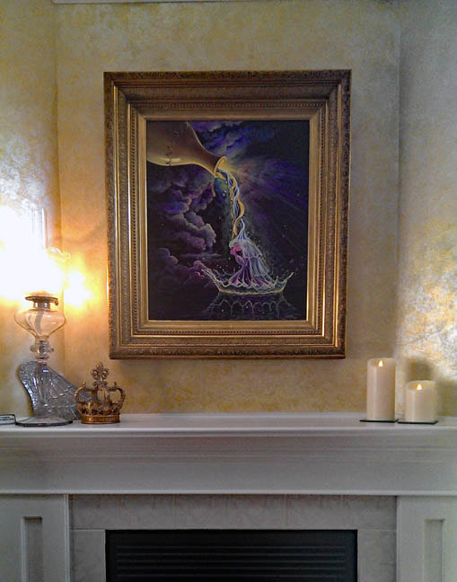 GET READY original painting hanging over the fireplace in the home of the collector
2 Comments
I was looking at my photos and came across this poster of color associations. Mind you, colors bring up emotions and memories that vary from person to person, depending on individual life experiences. My favorite color at the moment is hot pink, but, it could change. What's your favorite color? Color is soooo powerful and can have spiritual significance as well. Colors mean different things to different individuals. Cultures affect how we view color as well. And then there are those who are color blind, and can't distinguish colors at all. I love colors, the brighter the better. Below is a list of colors with some associations to that color. What do you think? When I paint, sometimes I consider the meaning of the colors, but mostly I just choose a color because I like it. 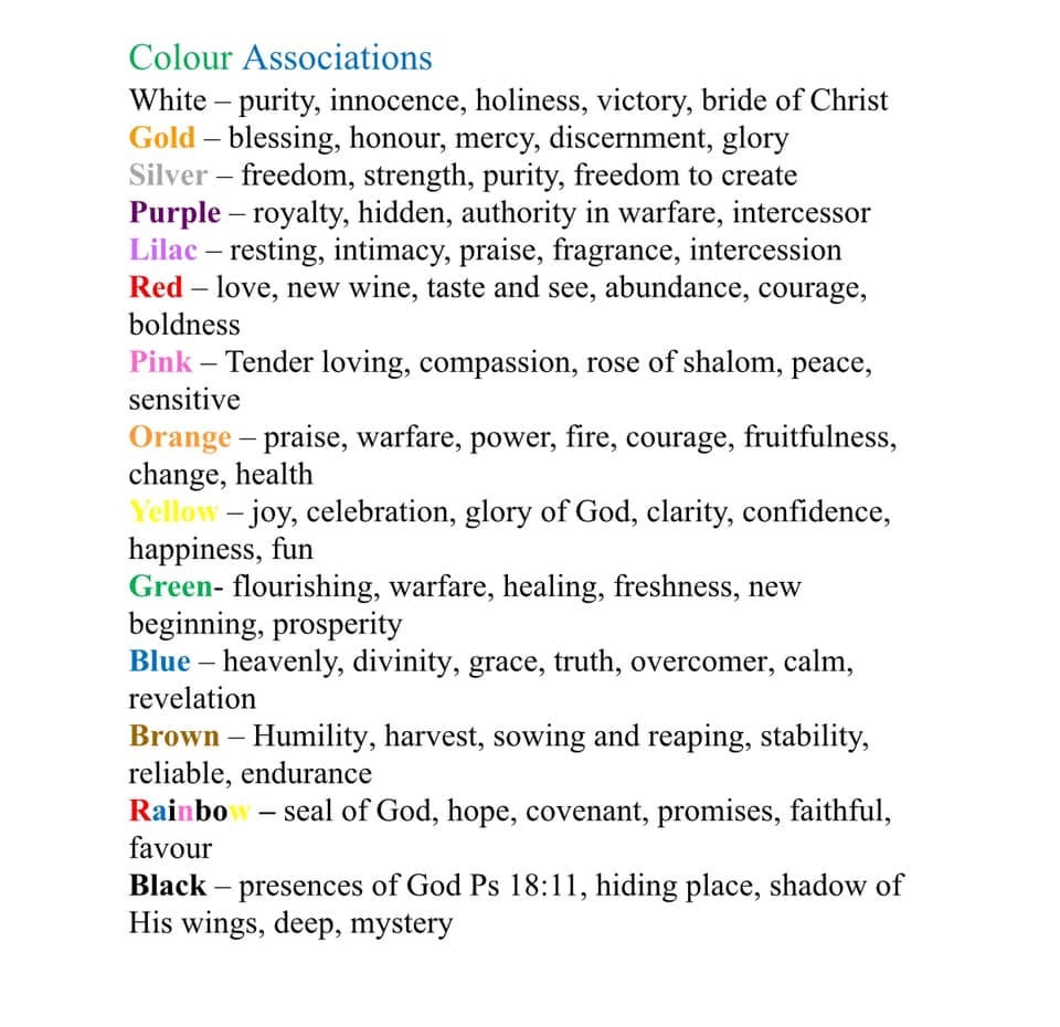 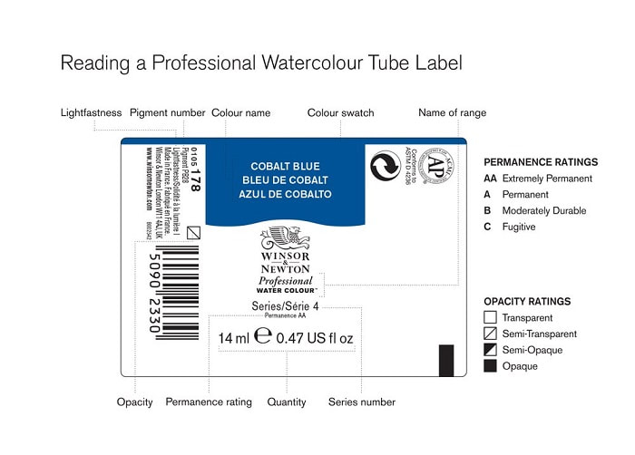 Name of range: This identifies the colour range.
Colour name: This is the name of the colour. These are not necessarily unique to a range or medium, e.g. Cerulean Blue exists in Watercolour and Oil Colour. Series number: This indicates the relative price of the colour and is determined mainly by the cost of the pigment. Series 1 is the least expensive and Series 5 is the most expensive. Colour swatch: Shows how the colour will look when painted out, without having to open the tube. Quantity: Indicates how much paint is in the tube. Permanence rating: The Winsor & Newton classification of permanence measures not only lightfastness but also film & chemical stability of the paint. Ratings are labelled as: AA - Extremely Permanent A - Permanent B - Moderately Durable Pigment Content: Each pigment can be identified by its Colour Index Generic Name. As an example: Cobalt Blue is Pigment Blue 28, abbreviated to PB28. More than one pigment abbreviation indicates multiple pigments. Opacity: Symbols are used to represent the transparency/opacity of a colour. Transparent colours are marked with , semi-transparent colours are marked . The relatively semiopaque colours are marked with and the opaque colours are marked with . Lightfastness: This is shown with an ASTM rating for the pigment. The ASTM abbreviation stands for the American Society for Testing and Materials. This organisation has set standards for the performance of art materials including a colour's lightfastness. In this system I is the highest lightfastness available, though both ratings I and II are considered permanent for artists' use. The AP (Approved Product) Seal: The symbol here identifies products which are certified by The Art and Materials Institute (ACMI) as art materials that are safe and certified by a medical expert to contain no materials in sufficient quantities to be toxic or injurious to humans, including children, or to cause acute or chronic health problems. ACMI’s toxicology team is located at Duke University, USA. 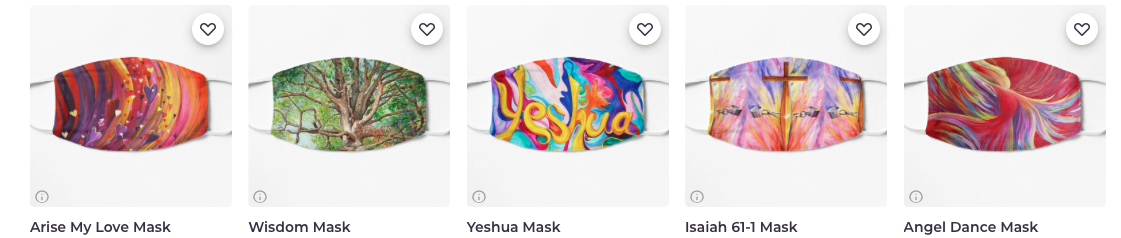 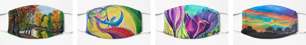 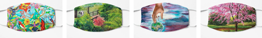 It's a sad day when the latest fashion is face masks. No one can see my smile, and I can't see theirs. We communicate with our facial expressions, but now we can't even recognize each other. We need our faces back!
At least we can keep our individuality through artful expression. It will never take the place of our faces, but, at least it can start a conversation. Communication is a good thing. You can order face masks at either of my print on demand websites now. Their design is slightly different between the two sites. 1. The first site has open sides to insert a filter and the sides are pleated. They are $14 each. https://nancy-cupp.pixels.com/shop/face+masks 2. The second site does not have the pleats on the side. If you order 4 or more they have a discount. nansees-art.redbubble.com |
Nancy CuppWant to know what's going on inside my head? I'd like to figure that out myself! Thus the blog. ArchivesCategories |

-
- Birds Of Praise
- Bliss
- Blossum Buddies
- Blue Orchids 1
- Blue Orchids 2
- Born Again
- Bridal Shower
- Christmas Flower
- Colors Of His Splendor
- Coming Lord
- Commissioned To Paint
- Daisy
- Dawn
- Dreams Take Flight
- Effervesce
- Eperchomai
- Evangel Of Hope
- Garden Party
- Grapes
- Heaven Awaits
- He Said Blue
- His Splendor
- Holy Fire Baptism
- I Give You My Heart
- I Love You Berry Much
- Intercession
- Immanuel
- I Rise To Thee
- Koi Joy
- Lady Love
- Light Of Life
- Love Is In The Air
- Morning Joy
- My Cup Runneth Over
- My Happy Place
- Pink Leaves
- Praise Him From The Heavens
- Purple Passion
- Regeneration
- Spirit Fire
- Redbud Special
- Red Rose
- Red Sunset
- Soft Eggs
- Strange Fruit
- Strawberry Passion
- Sunrise Over Indian Lake
- Symphony
- The Champion
- Touched By His Light
- Trust Me
- War Horse
- Wrapped In Angel Wings
- Yeshua
- Nancy's Videos
- Testimonies
- Art Videos
- Freebies
- Care of prints and original art
- Shop
Contact Me
 RSS Feed
